

Every block in a Layout Builder v1 layout can carry your own CSS classes. That is how you style one block differently from its neighbors without writing a selector that depends on where it happens to sit in the page.
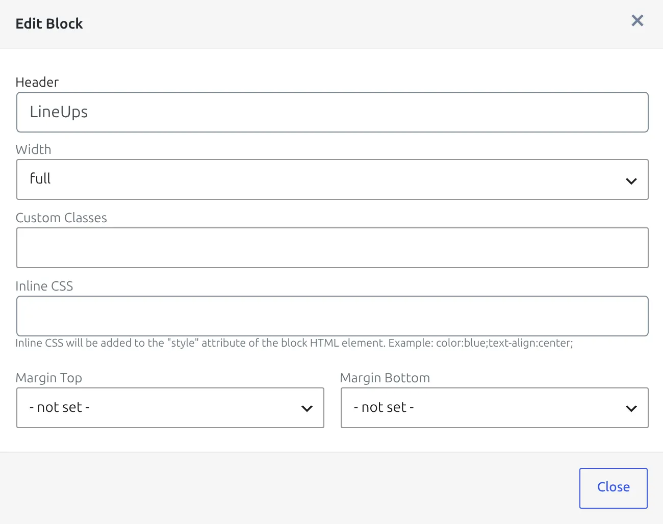
Four settings in a block’s options shape its appearance: Custom Classes, Inline CSS, Width and the two Margin dropdowns. They all end up in the same wrapper element, so it helps to see that element first.
🧩 The markup a block renders
A block comes out as a wrapper with an optional heading and a content div inside it:
<div class="anwp-fl-builder-block [width] [margins] [your classes]" style="[inline CSS]">
    <div class="anwp-fl-block-header anwp-text-xl">Your heading</div>
    <div class="anwp-block-content">
        ... the block's own output ...
    </div>
</div>
Three things follow from this. Your classes land on the outer wrapper, not on the block’s own markup. The heading is a sibling of the content, not inside it. And anwp-fl-builder-block is on every block, so it is the wrong hook for styling just one.
Custom Classes
Space-separated class names, no dots. my-featured-block, not .my-featured-block. The field is available on every block except Raw HTML.
Then target it from your theme’s stylesheet, or from Appearance > Customize > Additional CSS:
.my-featured-block {
    border: 2px solid #d32f2f;
    border-radius: 6px;
    padding: 12px;
}

/* just the heading of that block */
.my-featured-block .anwp-fl-block-header {
    color: #d32f2f;
}
Name classes after intent
A class like fl-match-sponsor survives a redesign; red-border-block stops making sense the moment the border turns blue. Prefix your own classes with something site-specific so they never collide with the plugin’s anwp- classes.
Inline CSS
Goes straight into the wrapper’s style attribute. Write declarations only, no selector and no braces:
color:blue;text-align:center;It is the quickest way to nudge one block, and the hardest to maintain – an inline style beats almost anything in your stylesheet, so a rule that works everywhere else will look broken on that one block. Reach for it when a value is genuinely unique to this block, and use a class for anything you might want to change later.
Width
Three choices, each adding a grid class to the wrapper.
| Setting | Class added | Behavior |
|---|---|---|
| full | anwp-col-12 | Full width at every screen size. |
| 1/2 | anwp-col-md-6 | Half width from medium screens up, full width on phones. |
| 1/3 | anwp-col-md-6 anwp-col-xl-4 | A third from extra-large screens, half on medium, full on phones. |
Note what 1/3 really does: it is a third only on the widest screens and a half in between. Two 1/3 blocks in a row of three will therefore wrap as 2 + 1 on a tablet. That is deliberate, and it is why three-column rows are worth checking at tablet width before you ship them.
Margin Top and Margin Bottom
Both dropdowns add a spacing class to the same wrapper. The values are steps, not pixels.
| Step | Top class | Bottom class | Space |
|---|---|---|---|
| 0 | mt-0 | mb-0 | none |
| 1 | mt-1 | mb-1 | 0.25 rem |
| 2 | mt-2 | mb-2 | 0.5 rem |
| 3 | mt-3 | mb-3 | 1 rem |
| 4 | mt-4 | mb-4 | 1.5 rem |
| 5 | mt-5 | mb-5 | 3 rem |
Each step also has a negative twin – mt-n1 through mt-n5 and mb-n1 through mb-n5, with the same distances pulled the other way. Negative margins are how you close the default gap between two blocks that are meant to read as one unit: give the upper block a bottom margin of 0 and the lower one a small negative top margin.
Margins need Load Legacy Bootstrap CSS
The mt-* and mb-* classes come from the plugin’s legacy Bootstrap stylesheet, which is on by default. If you’ve set Load Legacy Bootstrap CSS to No at Settings & Tools > Settings > Configuration > Advanced > Legacy CSS, both Margin dropdowns stop doing anything – and so does any mt-* or mb-* you typed into Custom Classes. Type anwp-mt-1 to anwp-mt-8 or anwp-mb-1 to anwp-mb-8 into Custom Classes instead. They’re always loaded and step in 5px (anwp-mt-4 is 20px), but they have no negative versions.
⚠️ Disable HTML Wrapper
The three Global blocks – Text, Shortcode and Raw HTML – carry one more toggle: Disable HTML Wrapper. Turn it on and the block outputs its content with no wrapper div at all.
It switches off everything on this page
With no wrapper there is nowhere to put the classes, the inline CSS, the width class or the margin classes – and no heading either. All of it is dropped silently. If a block’s styling suddenly does nothing, check this toggle first.
It exists for the cases where the wrapper itself is the problem: a shortcode that has to sit flush inside a theme section, or HTML that already brings its own container.
Reading a layout at a glance
Anything you set here is summarised on the block’s card on the builder canvas, so a layout can be reviewed without opening each block. A card showing Custom classes: followed by your class name is confirmation the value saved.
🆘 Troubleshooting
My CSS has no effect
Open the page, right-click the block and inspect it. If your class is not on the anwp-fl-builder-block element, either the layout was not updated after the edit, or Disable HTML Wrapper is on. If the class is there but the rule is not winning, the culprit is usually an inline style on the same block, or a more specific theme rule.
The class is there but the styling looks wrong inside the block
Your class sits on the wrapper, so a bare rule reaches the wrapper only. To style what the block rendered, go through the content div – for example .my-class .anwp-block-content table.
Two half-width blocks are not side by side
Both need Width set to 1/2, and they need to be adjacent in the same tab. Check the screen size too – 1/2 is full width on phones by design.
📚 Related
- Layout Builder – layouts, tabs and display rules
- Block Types – every block, by layout type
- CSS recipes – ready-made snippets for common changes