

The plugin uses a 9-slot semantic color palette to maintain consistent colors across all frontend blocks. Each slot maps to a CSS custom property (--global-palette1 through --global-palette9) available on both the frontend and admin.
Admin Menu: Settings & Tools > Settings (scroll to the Color Palette section)
🎨 The 9 Slots
| Slot | Group | Default Purpose | Example Usage |
|---|---|---|---|
| 1 | Accent | Primary accent | Buttons, active states, links |
| 2 | Accent | Secondary accent | Hover states, secondary highlights |
| 3 | Text | Heading text | H1-H6 headings, strong labels |
| 4 | Text | Body text | Paragraph text, table content |
| 5 | Text | Caption text | Subtitles, secondary labels |
| 6 | Text | Light text | Muted hints, timestamps, metadata |
| 7 | Base / BG | Main background | Page background |
| 8 | Base / BG | Card background | Card surfaces, content areas |
| 9 | Base / BG | Alt background | Zebra striping, tinted surfaces |
You can assign any color to any slot. The slot labels describe the intended purpose, but there are no technical restrictions.
Editing the Palette
- Go to Settings & Tools > Settings
- Scroll to the Color Palette section
- Click any color swatch to open the color picker
- Enter a hex value or use the visual picker
- Click Save Settings at the bottom of the page
Reset to Defaults restores all 9 slots to the plugin’s default colors.
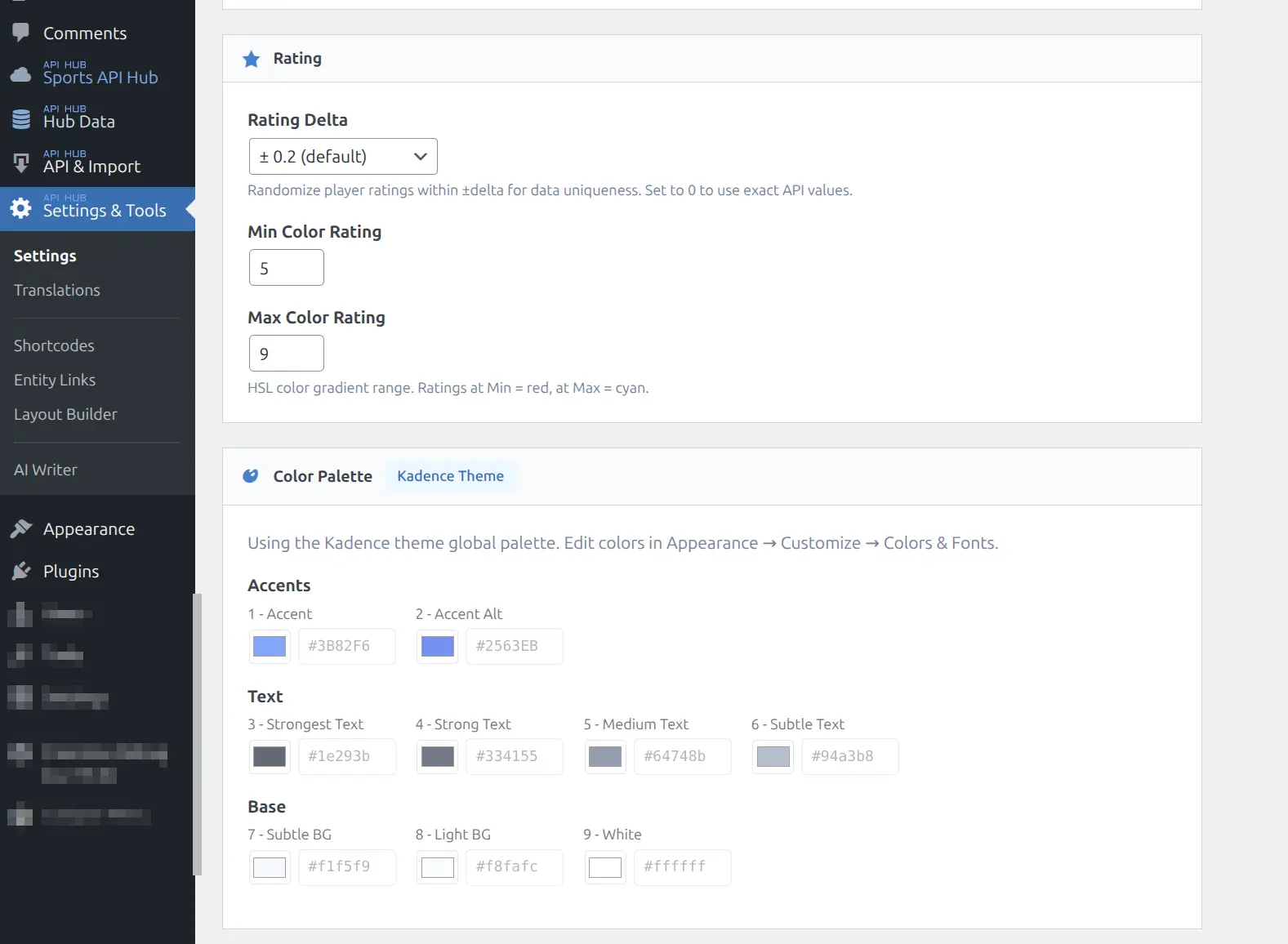
Kadence Theme Integration
When the Kadence theme is your active WordPress theme, the plugin automatically reads Kadence’s global palette. In this mode:
- The palette editor is disabled (read-only) and shows a “Kadence Theme” badge
- CSS variable output is skipped because Kadence already outputs
--global-palette1through--global-palette9 - Any changes to Kadence’s palette are reflected in the plugin immediately
This means zero configuration is needed if you use Kadence. Your theme colors and plugin colors are always in sync. If you switch away from Kadence, the plugin’s own palette editor becomes active again.
Tip
Kadence is not required. The plugin works with any theme. When using a non-Kadence theme, the plugin outputs its own --global-palette CSS variables.
🖌️ Using Palette in Layout Builder
When editing blocks in the Layout Builder, each color field (background, text, border) offers a toggle between Palette and Custom modes.
Palette Mode
Shows 9 clickable swatches matching your palette slots. Selecting a swatch stores a palette reference (e.g., palette1) rather than a hardcoded hex value. The rendered CSS uses var(--global-palette1).
Advantage: If you later change the palette, all blocks using palette references update automatically.
Custom Mode
Shows a standard color picker with hex input. The selected color is stored as a literal hex value (e.g., #2563eb) and does not change when the palette is updated.
Best Practice
Use Palette mode when you want consistency across blocks. Use Custom mode for one-off colors that should not follow the palette (e.g., a specific brand color for a sponsored section).
🔧 Using Palette in Custom CSS
The 9 palette colors are available as CSS custom properties on :root. Reference them in any custom CSS:
/* Use accent color for custom borders */
.my-custom-section {
    border-left: 4px solid var(--global-palette1);
}

/* Use the alt background for a custom panel */
.my-stats-panel {
    background-color: var(--global-palette9);
    color: var(--global-palette4);
}
Available Variables
| Variable | Maps To |
|---|---|
--global-palette1 | Slot 1 (Accent) |
--global-palette2 | Slot 2 (Accent) |
--global-palette3 | Slot 3 (Text) |
--global-palette4 | Slot 4 (Text) |
--global-palette5 | Slot 5 (Text) |
--global-palette6 | Slot 6 (Text) |
--global-palette7 | Slot 7 (Base) |
--global-palette8 | Slot 8 (Base) |
--global-palette9 | Slot 9 (Base) |
These variables work in the WordPress Customizer “Additional CSS” field, in your child theme stylesheet, or in any CSS loaded on the frontend.
Other Design Tokens
In addition to the palette, the plugin outputs three more CSS custom properties:
| Variable | Value | Purpose |
|---|---|---|
--ahub-border-radius | 0-12px (configurable) | Corner rounding for all blocks |
--ahub-border-color | #cdcfd1 | Structural border color |
--ahub-bg-alt | #f8f9fa | Alternate background tint |
These tokens are always output regardless of theme. See CSS Customization for more styling options. The border radius is configurable in Plugin Settings under the Display section.
📚 Related
- Plugin Settings — Parent settings page with Display, Rating, and Caching sections
- Layout Builder — Block editor with palette-aware color fields
- CSS Customization — Full guide to design tokens and BEM blocks